
No comments yet. Be the first.
Opinions are our own. Obviously.
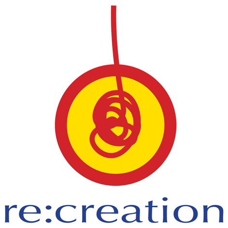
#10: re:creation
An upside down lollypop? A tangled Yo-Yo? Don't ponder on it for too long or you'll start thinking all kinds of things and have to visit a psychotherapist.
Anyway, whatever re:creation's logo is, it just somehow works.
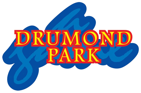
#09: Drumond Park
Here's a game for you... See how long it takes you to work out what the light blue words are in Drumond Park's logo.
#08: Matchbox
Although this logo is very much of its time, it's still as... err... striking as ever.

#07: Micro Scooters
Being striking and clever (but not so strikingly clever that you become annoying) is a hard balancing act for a logo designer to get right. Luckily Micro Scooters know more about balance than your average physics teacher - and it shows in their choice of logo.

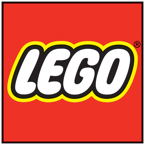
#06: LEGO
A controversially low entry for the king of construction? Maybe. It's an undeniable design classic. Just wouldn't want it on my t-shirt.
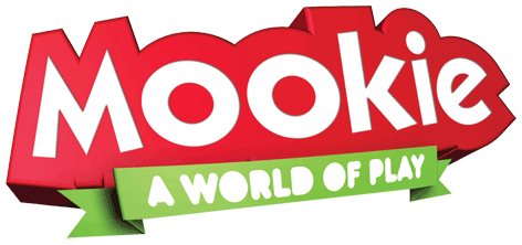
#05: Mookie
As the only 3D design in our top 10, Mookie's logo has a brilliant sense of energy. A masterclass in brand representation.
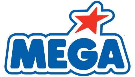
#04: MEGA
Red, white and blue; makes you proud to be British. What? They're American..?
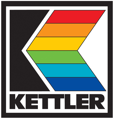
#03: KETTLER
"Dear Mr Kettler, we're the first printer in the county to get one of these cutting-edge, full-colour printers. I think I know how to put this technology to good use..."
This is, of course, the start of a completely fictional conversation, but it could have happened, right? Not that it's important how the real conversation went back in 1949. It's just a great logo and has stood the test of time brilliantly.
Plus... despite the pseudo rainbow, it doesn't look like an advert for a Gay Pride march. And that's not easy to pull off.
#02: VIVID IMAGINATIONS
I've never been a Page Boy, but if I had, no doubt I would have been shoved in a pink suit and a green tie. Would I have pulled it off? No of course not; which makes it all the more galling that Vivid can do it with such finesse.

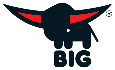
#01: BIG
I'd have loved to have been a fly on the wall when the logo designer did his "bull with oversized red horns standing on top of the word BIG" pitch. No idea why that's a suitable metaphor for a company making children's ride-ons, but it's a design classic - and we absolutely love it.
Still want more? Find out what the most overused colour in the world of toy logo design is. (Clue: It's not green.)
Add Your Comment to The Top 10 Toy Company Logos
Please confirm you have read our Terms & Conditions by clicking the checkbox above.